Categories
Essays Privacy Redecentralize

The tyranny of smart feed

Why reading news from Facebook is dangerous for you and your society.


Here I explain why it is dangerous to see the world through the window of Facebook, Twitter, or other “smart feed” websites. I’m not claiming that these social networks deliberately divide societies and distort your understanding of the world. However, I show that this is the unintended consequence of their business model. At the end, I propose some alternatives that you can try for yourself.

Is it Facebook, or is it the page I follow?

We used to get our news directly from journalists, i.e., from newspapers and lately from the websites that they run. Increasingly, however, we get the news from social networks like Facebook and Twitter. Effectively, we don’t find news anymore; we wait until the news find us in our Facebook or Twitter feeds.

While journalists are supposed to adhere to the principles of fair, accurate, and unbiased reporting, these social networks don’t have such principles. In contrast, and according to their business model, Facebook and Twitter are advertising companies. I’ll come back to this important point later.

You might say “I don’t get my news from Facebook itself. I get it from the pages and the people that I follow in Facebook.

Let’s be clear. If you follow the page of, say, The Guardian in Facebook, you’ll see Guardian’s articles in your home feed. But imagine you don’t check your Facebook feed for half a day. When you come back, which of the many posts from The Guardian come to the top for you to see? Do you see posts from The Guardian, or from other pages you follow, or from your many friends? Who decides which ones, and in which order?

It is clear that Facebook cannot and does not show you everything. There must be a “smart-feed algorithm” that decides which posts, among hundreds of possibilities, come to the top of your home feed (and no, they don’t come in a simple chronological order). If Facebook can choose which Guardian posts you do or don’t see in your news feed, it is fair to say that you are somehow subscribed to Facebook, not to The Guardian. This algorithm is so powerful, that it is shown to be able to make you happy or sad just by tweaking which friends’ posts they choose to show in your home feed (Ironically, this study was done by Facebook itself).

Isn’t that about showing the best content to me?

As with any other ad-funded company, Facebook wants you to spend more time on their platforms, so that they can sell more “ad impressions.” This forces Facebook to show you things that you like more and share more, because, otherwise you might just leave! In Facebook’s terms, your “like”s and “share”s mean money.

Exactly because of this market pressure, Facebook doesn’t show you posts which, in their opinion, could make you bored or disappointed. More importantly for us, if a news article is not compatible with your current beliefs and makes you feel uncomfortable, Facebook simply doesn’t bring it up in your home feed. Therefore in Facebook, what you believe is amplified, and what you don’t believe you never see.

As strangely as it may sound, this mechanism can detach you from the society and deepen mistrust between you and the people who have different beliefs than you. This will make it harder for you to have a conversation with someone with a different religion, political affiliation, or even personal trait. This is part of the reason why some recent elections in developed countries had surprising results for many of their citizens: People were only reading news items that confirmed beliefs they already had. They virtually lost contact with the other parts of the society.

As the Yiddish proverb says, “A half truth is a whole lie.” So Facebook is, unintentionally, lying to you.

This is what you can do

Because of what I have just explained, I find it personally irresponsible to expose myself to any smart-feed website regularly. As a result, I look for alternative ways to learn about the outside world. Below is a list of some of the things I do in this regard. I invite you to do the same and/or to share your alternatives.

For reading other people’s publications

  • Stop “reading news” from Facebook. If you use Facebook, Twitter, etc., strictly limit it to your close family (also see the last point below). Stop following politics and other things about the outside world that you want to be informed about.
  • Get your news “un-flitered” from news websites. Either by checking the websites directly, or by using a feed reader and subscribing to the website’s RSS/Atom feed (here is a handy list of some feed readers). Of course you will be taking care of following at least a few (preferably opposing) news agencies so that you have a chance to get a complete picture.
  • While you have your feed reader set up, follow some blogs! There are many people who regularly write great blog posts about every topic you can imagine. Try to change your media-consumption taste from reading 5-second-long notes on social media to reading well-thought, 5-minutes-or-more-long blog posts. It requires some discipline at first, but it’s totally worth it.
  • Be more active about what you find on the Internet. Set up a “read-it-later” service to save random interesting pages on the Internet that you’d like to read later (here is a handy list of some read-it-later services). Many of such services offer offline support, so that you can read the pages even without Internet access. When you make such a carefully curated list of interesting web pages, you are more likely to spend your daily commute in the train reading some high quality publications instead of erratically scrolling on your Facebook or Twitter feed.
  • As a stretch goal, I suggest you to quit using smart-feed social networks altogether, like me. Instead, migrate yourself and your friends to some socially responsible social networks; those that don’t have a secretive smart-feed algorithm. I strongly recommend that you try Mastodon (here is a handy guide for Mastodon beginners). It has a great user interface, a simple chronological time-line, and a thriving community. (Bonus point about Mastodon: it has no ads and it doesn’t track you everywhere you go on the Internet 🙂 .)

For creating new publications

  • If you often write notes or post photos online, publish your stuff first on a space that you control, and only then link to them from your social networking accounts. For example, if you already have a blog and you want to put something on Facebook, put it first on your blog, and then link to it from Facebook. (Same goes for the pictures that you post. There are many mobile blogging apps that help you easily do this.)
  • If you haven’t already, set up a blog! When you have something worth saying, give it some proper thought, spend the required time, and write it as a blog post. Writing your thoughts will help you as much as it helps your readers. (Here is a handy guide on how to set up a blog.)

If you have read all the way to here, then I think we have something in common that we can discuss 🙂 . I’d love to know about your opinion and experiences on this topic. Please write your thoughts below.

Categories
Development seq2vid

seq2vid 0.2 released

After 10 months of development, my command-line video composer seq2vid has a new release! This new version 0.2 has several new features and improvements.seq2vid

What is seq2vid?

seq2vid is a command-line video composer for GNU/Linux. It reads a sequence of texts, images, and videos defined in a text file and renders them all into a video. seq2vid can compose videos much faster than conventional (GUI-based) video editing software. It can also be deployed in batch processes and for automatically generating videos out of dynamic content. It is a free software project (GPLv3+ licensed) hosted on GitLab.

What’s new in seq2vid 0.2?

New features for users
  • A new textblock segment type: Now you can have segments with long, left-justified text blocks (commit, segment reference in the wiki).
  • A new fade transition style: You have the option between morph (the default transition effect) and fade to switch between your segments (commit). With fade, segments fade to/appear from the background.
  • New controls for extracting portions of a video: In video segments, you can now specify start_time and end_time parameters to include only a part of the video between two time points (commit).
  • New option for transition times: With the new parameter time_transition_pre, you can override the transition time for the previously defined segment (commit). This is especially useful for the POST segments of templates.
  • New and refined examples: Now you can get a better idea of what seq2vid is capable of, by reading the examples page of the wiki, or by looking at the examples directory in the code.
Fixes and enhancements
  • Better I/O management: Input/output files are now read/written where the seq file resides, not where the seq2vid scripts do. Several paths are also searched automatically to find assets mentioned in the input sequence files (commit).
  • Better temp file organization: All temporary files are now stored in a system-provided directory, usually inside /tmp (commit).
  • Default output video size: Dimensions of the output video now match those of the input video by default. A reasonable chain of priority is added for overriding the default video dimensions in the sequence and/or template file (commit).
Internal changes for developers and large deployers
  • There is a new page in the wiki that explains how seq2vid works.
  • seq2vid now defaults to ffmpeg (instead of libav-tools) for handling most video processing tasks (thank you hnrzi ?). The dependency on mencoder still exists though, since it produces higher-quality videos in some cases (commit).
  • A new unit test system has been added—currently containing 6 tests—for a fast and reliable development process. Tests are based on output file checksums, and the system provides an option to easily calibrate the tests for each development environment.
Known issues
  • In Fedora 26, fonts defined in the default template cannot be found. This is due to mismatch in the font naming conventions between Ubuntu and Fedora. This causes warning messages when building segments. Nevertheless, fonts are replaced by available system fonts as fallback.
  • In openSUSE Leap 42.3, the fallback mechanism for non-existing fonts does not work. This causes the text to not show up in the video output. A temporary workaround is to make sure that fonts are defined with exactly the same names as installed in the system.

Download

It’s easy to use seq2vid. All you need is a GNU/Linux box with a few multimedia libraries installed. Grab the the code, uncompress it, and start playing. I will appreciate your comments, suggestions, and especially feature requests!

Categories
Development Hardware

Live hardware hacking!

Recently I did something that I never thought would be possible: I short-circuited a chip on a laptop while it was on, and by that I could get some work done!

My goal was to remove the BIOS supervisor password from an old Thinkpad laptop that I bought second hand. The owners themselves forgotten what the password was, so I thought I would give the laptop a hand to free itself up!

But there was a little problem! According to Lenovo’s official documentation, the only way to reset/remove the BIOS supervisor password was to replace nothing less than the entire laptop motherboard ?.So, is there really no way to remove the supervisor password from this laptop’s BIOS? Well it turns out there is! Thanks to the always amazing tinkerer community on the Internet, I found about a way to remove supervisor password from Thinkpad laptops. But honestly, I did not really believe what I read until I did it myself ?.
 

How did I remove the supervisor password?

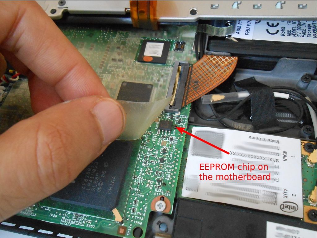
First, I had to find the EEPROM chip on my motherboard. I found it from a page that lists the location of this chip in many Thinkpad models. Apparently, this chip is where the supervisor password is physically stored and enforced in the hardware.

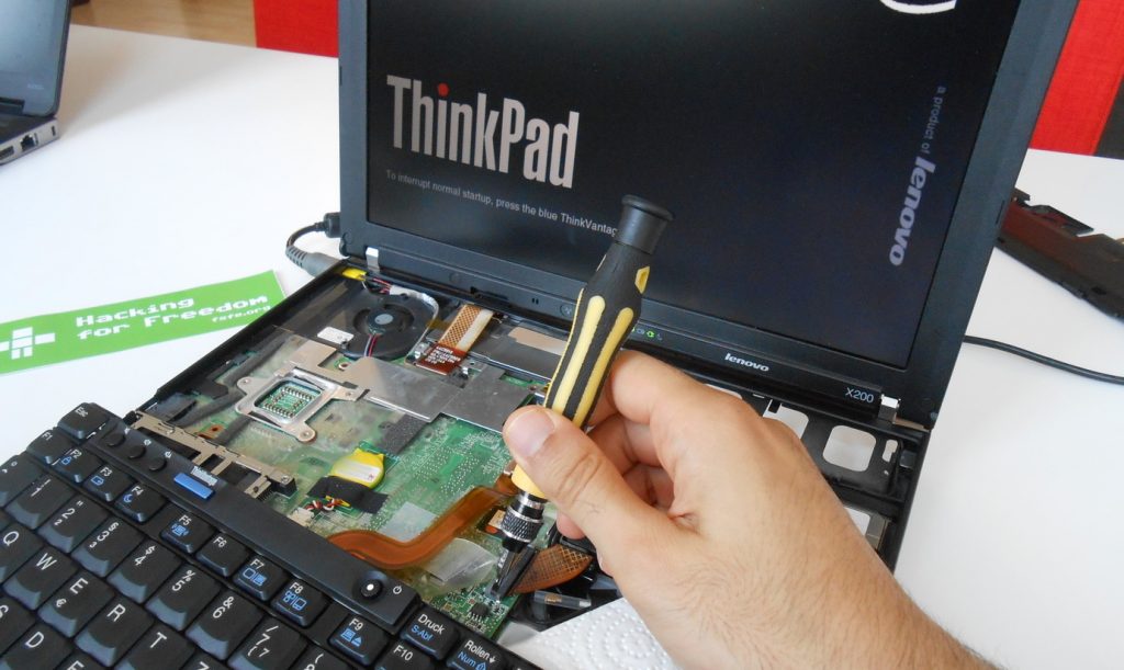
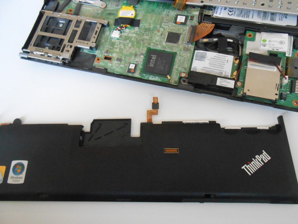
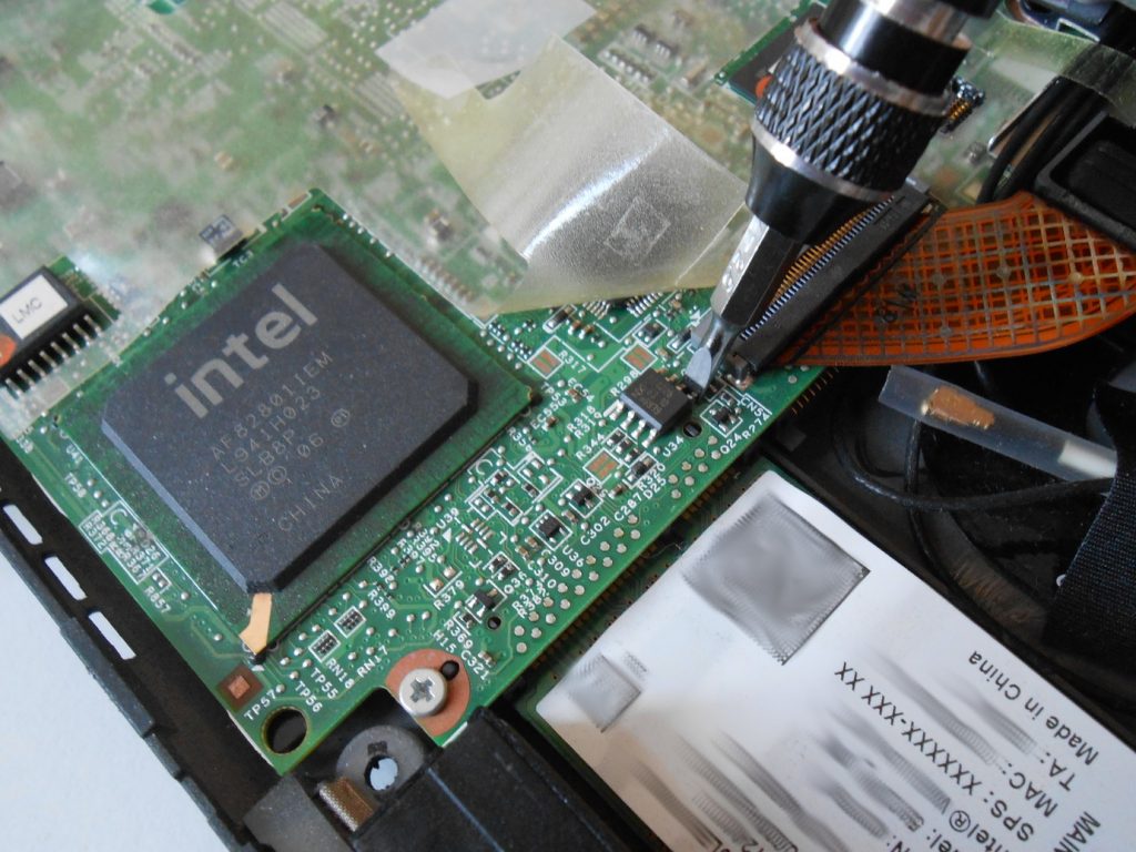
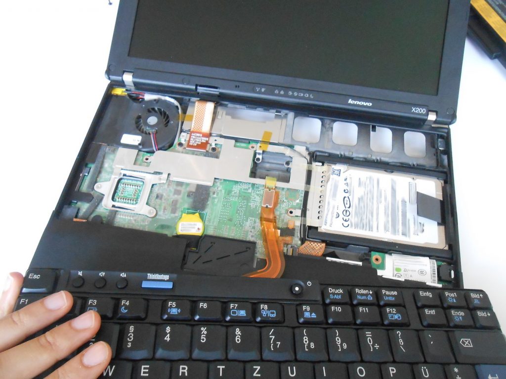
Then, I removed the keyboard…Then the palm rest…And finally, this is the EEPROM chip.

The next step was to use a screwdriver to short-circuit two pins (SCL and SDA) on the EEPROM chip. After turning on the computer and just before pressing F1 to load the BIOS setup, I short-circuited the two pins on the EEPROM chip. The timing for doing this was very critical and it took many unsuccessful tries, but eventually the BIOS loaded with the supervisor password apparently disabled.

When the BIOS setup screen loaded in a temporarily liberated state, without disconnecting the two pins, I reset the supervisor password to blank. (I leave it as a fun exercise to the reader to imagine me with one hand holding the screwdriver in place and with the other hand pressing keys on a wobbly keyboard that hangs from the laptop by a thin wire ?) Finally, I released the screwdriver and let the laptop reboot. After that, there was no supervisor password left on the BIOS ?.

Clearly, I do not really understand what I did in this process! I still don’t exactly know what an EEPROM chip is and what it does. Nevertheless, the whole thing worked, and I did something that I’d never done before: live hardware hacking on a running computer!

Categories
DuckDuckGo Privacy

DuckDuckGo has a more up-to-date index than Google

Today I had a nice surprise.

I was checking if anyone on the web has talked about my little free software project, seq2vid, in the past month.

I usually do it with a quick search on DuckDuckGo. I type seq2vid !gmonth in the search box of my Firefox browser, and hit enter…

DuckDuckGo search for seq2vid !gmonth… which means, I ask DuckDuckGo to redirect me to a Google search where the search options are set to show only results from the past month. I do all this by a simple !gmonth keyword in my search term. This is why I love DuckDuckGo so much: It makes web searching so much faster with a myriad of useful keywords (or bangs, as DuckDuckGo calls them).

But Google only found one result. Which inclined me to try something else. Why not trying a native DuckDuckGo search with !month instead of !gmonth?!

Which brought me the surprise! DuckDuckGo found about 100 results! Many of them where partly matching phrases like seq2 or seq2v, but there were some genuine results from people mentioning my little old seq2vid project ? that Google could not find.

This means, at least in this very case, DuckDuckGo’s index of the web is more up-to-date than Google’s. Given the resources of Google, I honestly find this really surprising.

DuckDuckGo billboard: Google tracks you. We don't. Search better at DuckDuckGo.com
source: intego.com

I already liked DuckDuckGo before. I like it because it doesn’t store my search terms (or so it claims) and because it is a fast and powerful gateway to other search engines. However, I only occasionally used its native search index. Now, I feel it is a serious contender for Google in the last possible way, indexing the web, and I am of course very happy about it!

Categories
Essays Nextcloud Redecentralize

Dropbox user? Three practical reasons for switching to Nextcloud today

If you use Dropbox to sync files between your devices or to share them with your friends, you should seriously think of switching to Nextcloud. Here I give you three practical benefits that you get if you migrate your files to Nextcloud. But first, I should tell you what it really is.

Nextcloud is a collection of computer programs that make it super easy for you to sync and share your data anywhere and in any way you want. You can think of it as Dropbox, except that you would be the CEO of Dropbox, Inc: It’s you who sets the rules on how much storage you get, where you sync your files, and how the desktop and mobile apps look like. If this is too much control that you don’t want to be hassled with, no worries! Nextcloud gets you covered as well.

Because you have all your options on the table.

You can use Nextcloud storage from your company/university/school, you can set up your own Nextcloud server, or you can choose from many companies that provide Nextcloud services for free or for highly-copetitive prices.

But is it any better than Dropbox? Keep reading to see it for yourself.

1. More storage space

Whether you are a student or you work, chances are that your school or organization already has a Nextcloud instance running on their internal severs. Just ask your IT help desk if they offer Nextcloud storage, and you may be surprised! In Germany, where I live, an increasing number of schools, universities, and companies offer such storage to their students and employees. I myself got a hefty 50GB of storage from the very fast servers of my research institute, and many of my friends have similar plans (ranging from 30GB to 100GB) from their universities.

Even if your school or company doesn’t provide that for you, it is easy to find Nextcloud providers that offer free storage plans ranging from 2GB to 5GB. And since the Nextcloud apps support multiple accounts on the same device, you can simultaneously use different providers to get as much storage space as you wish.

Finally, if you are savvy enough to set up your own Nextcloud server (and it’s not really difficult), or you already own the beautiful Nextcloud Box, you can literally connect an external hard-drive to your Nextcloud server and use its full capacity to sync and share your files.

2. More than just files

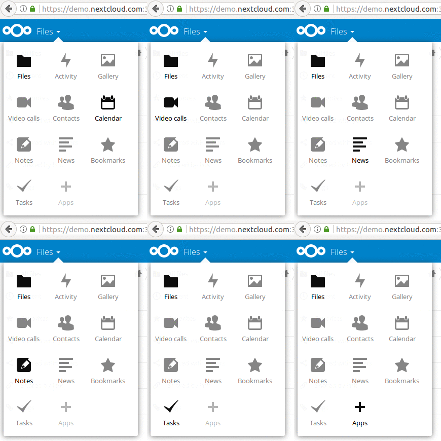
While with Dropbox you can only sync and share your files, Nextcloud gives you the option to sync your calendars, contacts, tasks, SMS messages, Notes, bookmarks, RSS feeds, and…​ the list goes on. In fact, the Nextcloud project provides an open API (Application Programming Interface) for software developers to make Nextcloud Apps; extensions that add new functionalities to the core Nextcloud platform. Recently, they announced Spreed.ME, a video/voice chat app for real-time communications inside the browser, and also Collabora Online, an online office suite based on LibreOffice.

With Nextcloud, you can simply enable apps to add new functionalities for storing and sharing all kinds of your data.

3. More sharing freedom

With centralized services like Dropbox and Google Drive, you can only share your files with people who are on the same service. And if you need to share your Dropbox file to a Google Drive user, you usually have to make a public link and send it around. However, anyone with the link can access the file, which is a security risk.
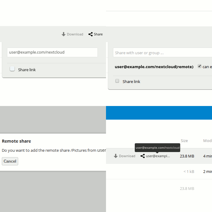
Nextcloud solves this problem by a concept called federation, where users from different Nextcloud servers can seamlessly exchange files with each other. For example, if you have a Nextcloud account from your company and your friend has one from her university, you can still easily share files as if you are on the same Nextcloud server. Furthermore, other file sharing solutions like Pydio and ownCloud have implemented the same sharing protocol as Nextcloud, so that you can exchange files with users of those platforms, too.

In addition, Nextcloud supports password-protected public shares; something that Dropbox only offers to its paid customers.

Bonus: Protection against mass data surveillance

As security expert Bruce Schneier says, security is a process, not a product. Therefore, while there is no such thing as a perfectly secure product, there are ways to get more protection. With Nextcloud, whether you sync your files to your very own private server, or you use the service of a local provider, your data is stored outside of the big centralized services which are very attractive targets for malicious hackers and oppressive governments alike.

There you have it. If you want to try Nextcloud, head over to https://nextcloud.com and get started today.

Categories
Notes

FOSDEM17 videos are up!

There were 668 talks during two days of #FOSDEM17. Yes you read that right. Go watch some if you can! https://video.fosdem.org/

Categories
Design Development i18n Ubuntu

Persian keyboard layout for Ubuntu phone – Part 4: Final design touch

Or, why Ubuntu touch has will soon have a better Persian keyboard layout than Android?

I finally completed the design of the Persian layout with all of its bells and whistles, and I have proposed the layout for merging into the Ubuntu project. I am excited to share with you some screenshots!

At the end of this post, I will discuss why this layout is even better than the current golden standard for mobile Persian layouts, which is implemented in Android.

Screenshots

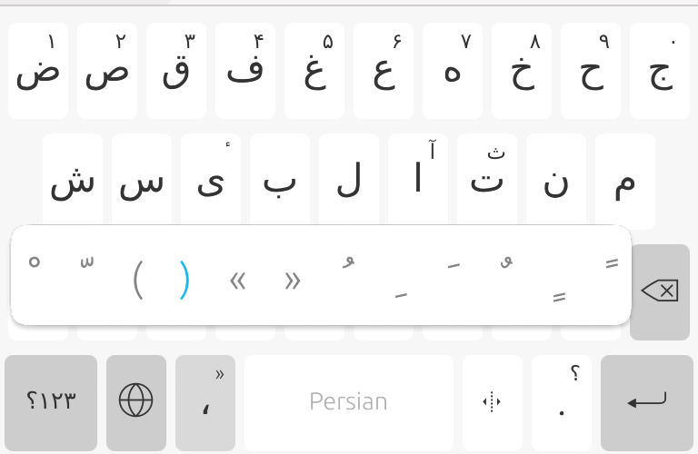
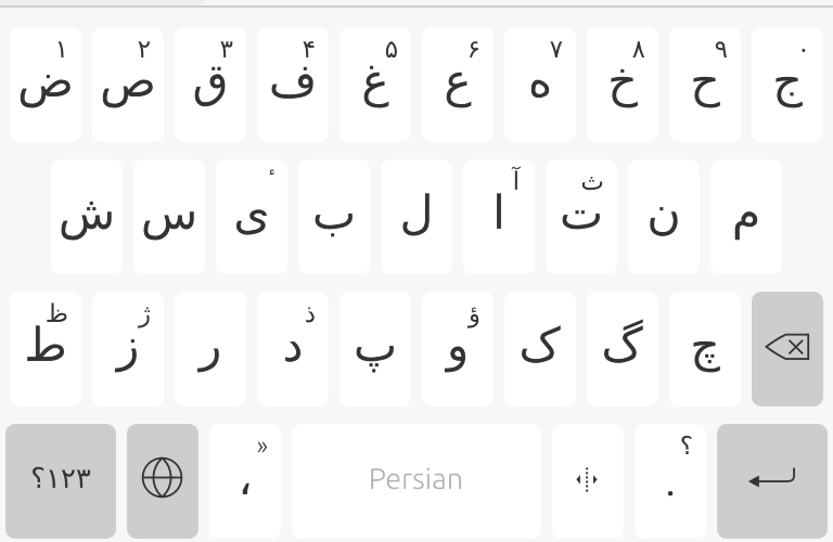
Normal mode. Keys in the bottom row from left: symbols shift key, language menu, comma, space, zero-width non-joiner (ZWNJ), dot, and backspace.


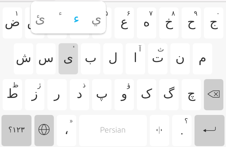
Normal mode. Extended keys for Persian letter Yeh (ی).


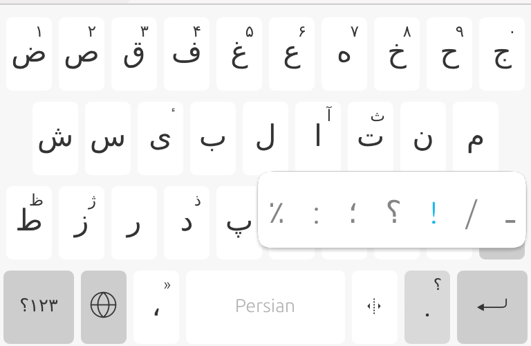
Normal mode. Extended keys for dot, from left: Persian percent sign, colon, semicolon, Persian question mark, exclamation mark, slash, and Persian Kashida.


Normal mode. Extended keys for comma: Persian- (and French-) style quotation marks, parentheses, and Persian/Araic diacritics.


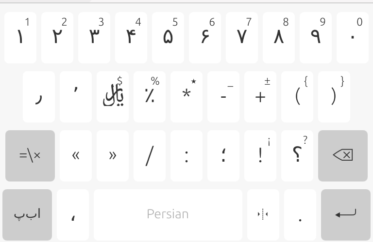
Symbols mode. Keys in the second row from left: decimal separator, thousands separator, and Iranian currency symbol ﷼ (Rial). Note also that the ZWNJ key is now replaced by ZWJ.


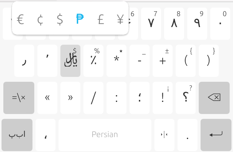
Symbols mode. Extended keys for Rial (currency) key.


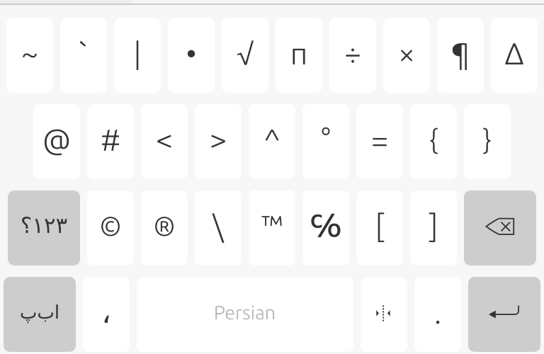
Symbols mode, shifted.


Why is this better than the Persian layout in Android?

In the design of this new Persian layout for Ubuntu phone, I have addressed the following shortcomings in the Persian keyboard layout in Android. Some of these points are repeated from a previous blog post, while some others are new.

  • Android has no question and exclamation marks in its normal mode, not even as extended keys. The user has to switch to symbols keyboard to type either of these frequent characters.
  • Android has no decimal or thousands separator (٫ and ٬, respectively). A dot character (.) is no replacement for decimal separator in Persian since it is terribly similar to the Persian zero digit (۰). Many people mistakenly use a slash character as a replacement for decimal separator, and it results in BBC Persian to mis-report earthquake magnitudes.
  • In Android, keys from different rows are all aligned horizontally (see a screenshot). This is unlike the US/UK layouts where for example the key “A” is between “Q” and “W” (in the lower row). This perfect alignment will increase probability of mis-typing.
  • Android keyboard is too crowded with some consonant letters that are rarely used in modern Persian writing. Based on the results from this letter frequency analysis tool that I developed myself, I have removed the least-used characters from this Persian layout, and people seem to be happy about it.

Remaining issues

There are some minor issues about this keyboard layout that are beyond the layout itself, and should be addressed in the ubuntu-keyboard package as a whole. I am interested to work with other Ubuntu developers to find a proper way to fix these minor issues in the future.

First, the ubuntu-keyboard package does not provide an easy way to define a key where the label of the key is different from what it inserts into the text. The ZWNJ and ZWJ keys are good examples, and they are now working only thanks to a sub-optimal hack.

Second, key labels have an LTR (left-to-right) directionality by default. This forced me to add an RLM (right-to-left mark) character after all directionally-weak characters (e.g. parentheses and brackets) to make them show up correctly on the key label. As a result, these invisible RLMs are inserted into the text whenever the user types e.g. a parenthesis. While this is not a big issue (RLM is invisible), this has to be fixed to avoid possible text-processing issues with some legacy software.

What’s next?

For me, this was a beautiful experience for contributing to the Ubuntu project. I look forward to see this layout merged into the project, and to make more code contributions to Ubuntu.

Categories
Design Development i18n Ubuntu

Persian keyboard layout for Ubuntu phone – Part 3: Layout design

The Persian alphabet is based on the Arabic script, although the two languages are linguistically very different. The alphabet has 33 main letters (including hamza) and a dozen of diacritics (short vowels) and punctuation marks. To type Persian text in the computer, however, some extra invisible characters are essential. These include the space key (of course!) and the Zero-Width Non-Joiner (ZWNJ) key.

Design goals

  • The Persian layout should allow the user to insert anything needed for typing a Persian text. These include Persian letters, numerals, punctuation marks, diacritics, and control characters.
  • The layout should be easy to use. This means:
    • Frequently-used letters should be available to type directly, without using a “shift” or “alt” or other modifier keys.
    • Less frequently used letters should be hidden as extended keys to save screen real estate, so that the rest of the keys are larger and hence easier to access.
    • As I wrote in my first post in this series, it is preferred that keys from different rows are NOT horizontally aligned, to reduce chance of mistyping letters. This condition requires neighboring rows in the keyboard to have different number of keys.
  • The layout should be familiar for users of the standard Persian layout for the desktop, as defined in the standard ISIRI 9147.

Letter usage frequency in Persian

To decide which characters are used frequently and which are not, I analyzed the text of a free Persian ebook from Project Gutenberg, using a small tool I made with bash and gnuplot (there is also a similar tool as a perl script from Jadi). This is the distribution of letter usage in Persian.

This distribution is of course different from text to text. In this ebook, for example, there is an unusually low number of ZWNJ’s (as shown by ⟘ in the plot above) and not a single Persian numeral. I made the same distribution for a collection of my own posts in Google+, and also for articles in the political page of a mainstream Persian newspaper. In all cases, the following letters were always used the least: ‎ژ, ؤ, ئ, ث, ض, ظ‎ and غ. This is also consistent with what Jadi obtained by analyzing another pile of contemporary Persian text.

Layout design proposals

Based on the above constraints and considerations, I came up with two designs for the Persian layout.

Proposal #1:

First row, 10 keys, extended keys for numerals. Letters غ and ض are NOT hidden to make enough keys for 10 extended numbers
ج ح خ ه ع غ ف ق ص ض 
۰ ۹ ۸ ۷ ۶ ۵ ۴ ۳ ۲ ۱

Second row, 9 keys
م ن ت/ث ا ل ب ی س ش

Third row, 9+1 keys (including backspace)
‏←‏ چ گ ک و پ د/ذ ر ز ط/ظ

Proposal #2:

First row, 9 keys, less frequent letters are hidden
چ ج ح خ ه ع/غ ف ق ص/ض

Second row, 10 keys, extended keys for numerals, letter ث is not hidden
م ن ت ث ا ل ب ی س ش
۰ ۹ ۸ ۷ ۶ ۵ ۴ ۳ ۲ ۱

Third row, 8+1 keys (including backspace)
‏←‏ گ ک و پ د/ذ ر ز ط/ظ

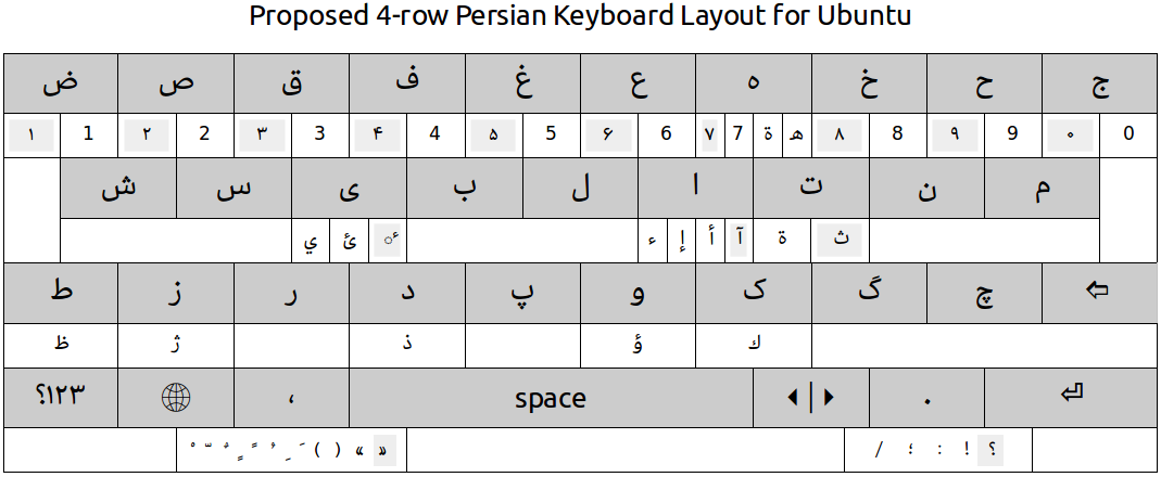
Both of the two proposals look good. I finally decided to go with proposal #1, since it has numerals in the top row (as it is more common in soft keyboards). In the picture at the top of this post I have sketched the final layout (in the normal and extended modes), also including the 4th row.

Preliminary keyboard layout implementation

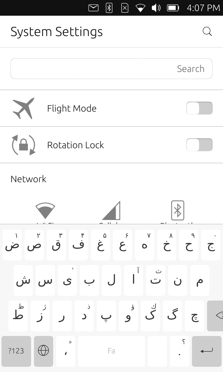
The following is my implementation of the Persian layout for Ubuntu touch as of now. There is a problem with aligning the backspace key. Also the ZWNJ key shows an empty label (since it inserts an invisible character into the text), while the symbol shift key (?123) still shows the English label.

Next, I am going to fix the small problems I mentioned above. Also, I will start the design of symbols keyboard, i.e., the keyboard that appears by pressing the ?123 (or rather, ‏۱۲۳؟) key.

Categories
Development Ubuntu

Persian keyboard layout for Ubuntu phone – Part 2: Build environment

Or, how to mess with a perfectly working keyboard. Where is the Q, by the way? ?
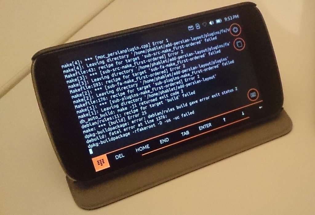
Before making any new layout, I should first get the relevant source code and see if I can compile the package as it is, and to install the compiled package to see it in action. A quick search for “Ubuntu touch keyboard layout” landed me on this AskUbuntnu exchange, which in turn pointed me to this very useful page about keyboard layouts in the Ubuntu wiki.

The source code

The keyboard in Ubuntu touch comes from a package called ubuntu-keyboard and is hosted on Launchpad. I downloaded the repository for this package by running

bzr branch lp:ubuntu-keyboard add-persian-layout

Layouts for different languages are defined as plugins to the ubuntu-keyboard package. For example, the English layout is defined in

add-persian-layout$ ls plugins/en/*
plugins/en/en.pro

plugins/en/qml:
Keyboard_en_email.qml  Keyboard_en_url.qml       qml.pro
Keyboard_en.qml        Keyboard_en_url_search.qml

plugins/en/src:
database_en.db     englishplugin.json  src.pro
englishplugin.h  overrides.csv         the_picture_of_dorian_gray.txt

plugins/en/tests:

From the above, files with qml suffix define key arrangements. Each of these layout variants have keys specific to their use case. For example the email layout (Keyboard_en_email.qml) has a dedicated “@” key to make it easier to type email addresses.

Compile recipe

I had no idea how to compile the ubuntnu-keyboard package. So I wrote to Mike Sheldon, an Ubuntu developer who has done many recent commits to this package. He nicely helped with the following compile recipe. Thank you Mike!

1. Start a shell session on the device: phablet-shell

2. Make the root partition writable:

sudo mount -o rw,remount /

3. Install the build dependencies:

sudo apt update
sudo apt install devscripts bzr build-essential debhelper doxygen libanthy-dev libchewing3-dev libgl1-mesa-dev libgles2-mesa-dev libglib2.0-dev libgsettings-qt-dev libmirclient-dev libhunspell-dev libpinyin7-dev libpresage-dev libxml2-utils maliit-framework-dev pkg-config python3-flake8 python3-setuptools qt5-default qtbase5-dev qtbase5-private-dev libfontconfig1-dev libfreetype6-dev libudev-dev libmtdev-dev libxrender-dev qtdeclarative5-dev qtdeclarative5-private-dev xvfb presage

4. Checkout your branch on the device:

bzr branch <your branch>


5. Run “debuild” in the root of your source checkout, this will build all the packages and place them in the directory above your source directory

6. Install the new packages:

sudo dpkg -i ../*.deb

7. As this also installs the autopilot tests the first time around you’ll need to also run:

sudo apt -f install

8. Stop the current maliit-server:

stop maliit-server

9. Restart maliit with additional debugging:

MALIIT_DEBUG=true maliit-server

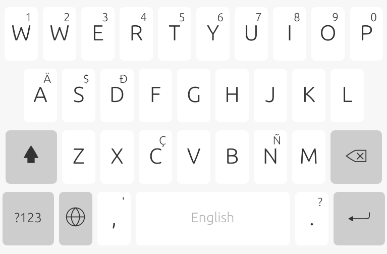
I did all of the above successfully on my Nexus 4. To make sure everything has actually worked, I replaced the key for “Q” and changed it to “W”. This change does show up in the keyboard, as you can see from the image at the top of this post.

Side notes

Insufficient space on root partition

I had problems with installing the development tools (step 3 above): packages failed to install due to insufficient storage in the root partition of my Nexus 4. I uninstalled many apps to free some space. At the end, I had to completely wipe the phone and install a fresh Ubuntu image. Even more, I had to also delete some not-crucially-needed system directories

sudo rm -r /usr/share/locale-langpack/[!en]*

This is a terrible thing to do on a production system. But since I use the Nexus 4 only for development, it just provided me with the much needed free space to install dev tools.

Difficulty in editing files on the phone

Since editing any text file on the phone is very difficult, I did all the actual edits on my desktop machine, synced  it to my ownCloud instance, and downloaded the edited files via wget.

Compile process stopped by the phone OS

Each compile takes about 45 minutes to complete. During compilation, if I switch out of the terminal app, or if the phone is locked after a few minutes of inactivity, the compile process is stopped by the OS. I assume this is done to all app in order to save power. To prevent this, I disabled screen locking in Setting -> Security and Privacy -> Locking and unlocking.

What’s next?

In the next posts, I will continue to document my work on making a Persian layout for Ubuntu phone. Meanwhile, I’d love to hear your comments. If you are expert in Ubuntu touch development, do you see something that I am doing wrong or inefficient? If you are an Ubuntu phone end user, do you need a particular keyboard layout to be added or fixed?

Categories
Development i18n Ubuntu

Persian keyboard layout for Ubuntu phone – Part 1: What to expect

Ubuntu touch does not have a Persian keyboard layout (as of December 2016). I thought it would be a valuable contribution to the Ubuntu project if I could make one. I had previously designed and implemented a soft keyboard layout for Android (that is, Persian layout for the excellent Hacker’s Keyboard by Klaus Weidner). I knew that making a new keyboard layout for an existing keyboard system should not be so difficult: as long as I start from an existing keyboard layout that is most similar to Persian (e.g. Arabic), I can replace Arabic characters with Persian ones and the rest would be mostly cosmetic changes.

That’s why I decided to make it.

Android’s Persian keyboard layout

But before I start, let’s take a look at Persian keyboard layout in my Android smartphone running Android 5.1. The following is the Persian layout in Android in its various modes.

normal mode
normal mode, extended letters for Alef
normal mode, extended diacritics symbols
normal mode, the Zero-Width Non-Joiner (ZWNJ) key, together with the extended form, Zero-Width Joiner (ZWJ)
symbols mode
symbols mode, extended Rial (currency) key
symbols mode, shifted

From the above, it is evident that there is a lot going on in the Persian layout of Android 5.1. It requires much more work than to just replacing a handful of characters in the normal mode of a Latin layout and to call it a Persian layout. Most notably,

  • there is no shift key in the normal mode for Persian layout. The Arabic script (which is also used in modern Persian language) does not have a concept of lower case and upper case.
  • The extended keys of the dot key are completely different from a Latin layout. They are filled with diacritics symbols used in the Persian alphabet. Theses are the symbols that represent short vowels in the Arabic script.
  • There is a separate key near the space key dedicated to ZWNJ, and its extended key, ZWJ. These (invisible) special characters are defined in unicode and control how neighboring characters join or not join. The symbols shown on the key buttons are different from what they actually insert into the text.
  • In the symbols mode, Persian digits are used instead of Latin digits (e.g. ۲ instead of 2). Notice also that the same Persian digits are shown as small hints in the normal mode of the Persian layout (the upper row of the keyboard). Also, Persian currency symbol (Rial) is used.
  • When in symbols mode, the key to switch back to normal mode is not “ABC”, but “اب‌پ” (the first three letters of the Persian alphabet).

If I set Android Persian layout as the ultimate goal for Ubuntu touch, it is clear from the above that I should

  • define a separate symbols keyboard, specific to Persian,
  • define special keys for ZWNJ and ZWJ, in the same way that other special keys (shift etc.) are defined,
  • make sure Persian digits are used in symbols mode and are also shown as hints in the normal mode

However, I have some criticisms for the Android layout, and I would like to avoid those (in my opinion) Android’s mistakes. Most importantly,

  • there is no (Persian) question mark (؟) and comma (،) in the normal mode. One has to enter symbols mode to enter them. In Latin keyboards, both such keys are extended forms of the dot (.) key and can be typed very quickly directly from the normal mode.
  • Keys from different rows are all aligned horizontally. This is unlike Latin keyboards where for example the key “A” is between “Q” and “W” (in the lower row). This perfect alignment will increase probability of mis-typing. It would be nice to make a different number of keys in each row of the layout, so that keys from different rows are not horizontally aligned.
  • There are simply too many consonant characters that are hardly used in Persian. I would very much prefer to hide keys Jeh (ژ), Theh (ث) and Thal (ذ) as extensions to keys Zeh (ز), Teh (ت), and Dal (د), respectively. This will save some precious horizontal space, and will make the keys larger, hence easier to type.

In the next post, I will write about the first steps to make changes to the Ubuntu keyboard.